Week 10 - Type and page. Constructs of typography, systems and theory.
By the end of this week, you should be able to:
Research into typographic design broadly.
Analyse how typographic conventions and design can inform and imbue the meaning of a given text?
Imagine how written text can be translated and communicated into a new typographic form.
Create and analyse your typeset piece.
Document and communicate your working process on your blog.
Participate in and reflect upon debate on the ideas wall.
Manage your independent learning through good planning and self direction.
Week 10 - Guest lecture - Kristoffer Soelling (Regular Practice)
Type and Press
It was fascinating to listen to Kristoffer discuss the history of printing from the early printing and systems of type to the modern day digital presses. The printing process has come a long way from the era of scribes to the modern day. In ancient times, books were painstakingly copied by hand by scribes, who were trained in the art of calligraphy. The invention of the printing press in the 15th century by Johannes Gutenberg revolutionized the printing process, allowing for mass production of books and other printed materials.
The earliest printing presses used moveable type, where individual letters could be arranged to form words and sentences, and then inked and pressed onto paper. This method remained largely unchanged until the 20th century, when the introduction of offset printing and digital printing brought further advancements in speed and quality.
Today, printing press technology has advanced to the point where high-quality printing can be achieved quickly and efficiently, making it an indispensable part of modern society.
Type and Press
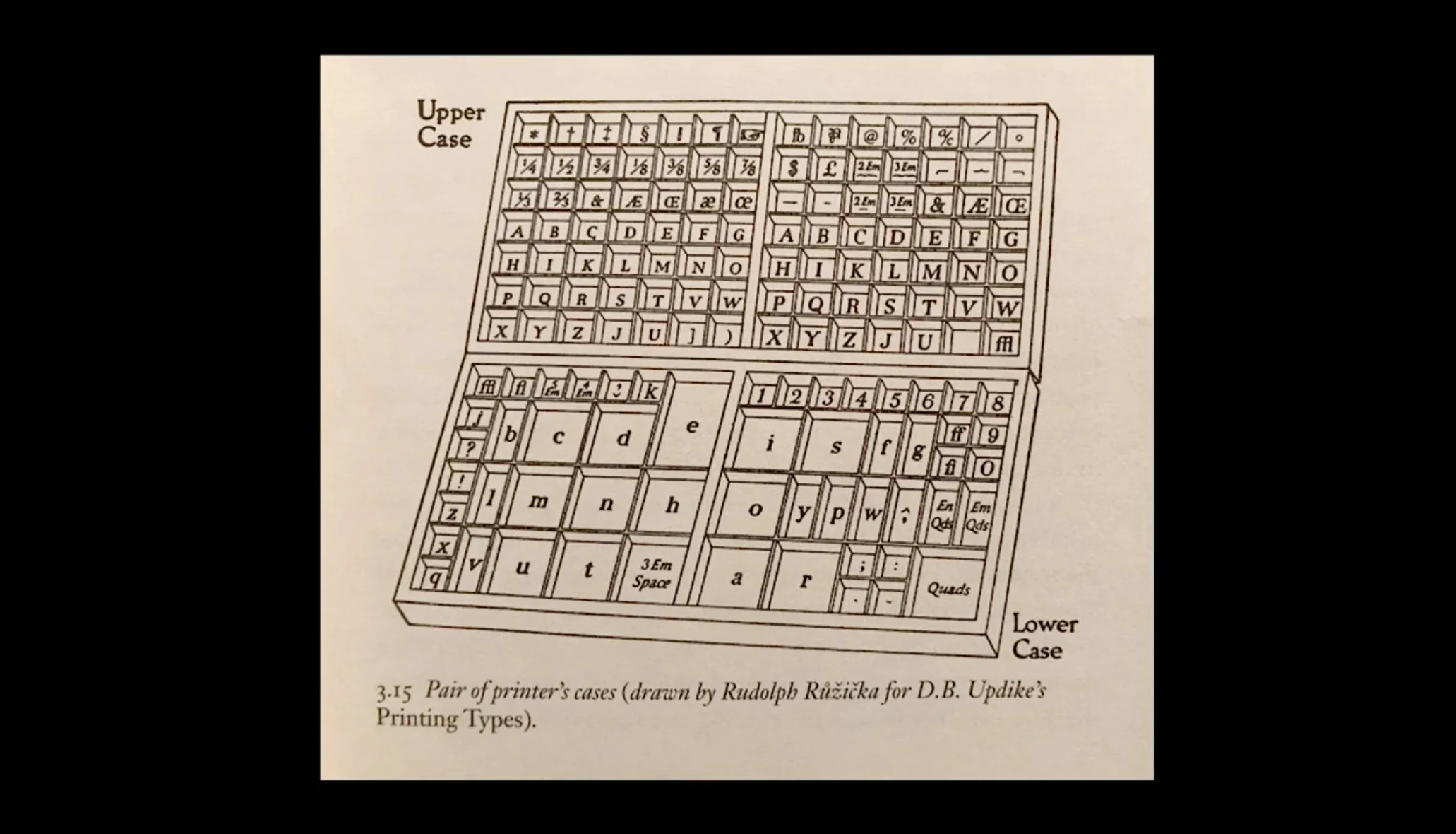
Upper and Lower type cases were named after literally being in the upper and lower cases.
Type and Design
The use of typography in graphic design has been an essential element of visual communication from the early 20th century to the present day. In the early 1900s, the Dada and Bauhaus movements in Europe revolutionized graphic design by emphasizing the importance of functionality and simplicity. They focused on typography as a tool to convey messages, rather than just decoration.
Otl Aicher, a German graphic designer, took the Bauhaus philosophy further and developed a new approach to typography that incorporated modular design, minimalism, and the use of a grid. In the 1980s, designers like Neville Brody with his letterforms of FF Blur, fuzzy around the edges like an out-of-focus photograph and then later Designers Republic pushed the boundaries of typography further, experimenting with digital technology, vibrant colours, and a bold, anti-establishment aesthetic. They challenged traditional design principles and made typography a key element of visual culture.
Today, typography continues to play an essential role in graphic design, and designers continue to push their boundaries through innovative techniques and cutting-edge technology.
Make it stand out
Whatever it is, the way you tell your story online can make all the difference.
Research - Key influencers in Graphic Design
Neville Brody
Neville Brody is a highly influential British graphic designer, typographer, and art director who rose to fame in the 1980s. He is best known for his pioneering work in the field of typography and graphic design, which challenged traditional design practices and helped define the visual language of British popular culture during that era. Brody was a key figure in the emergence of postmodernism in the UK, and his innovative approach to typography helped define the visual aesthetics of the punk and new wave movements. He worked on numerous projects, including editorial design, album covers, and branding for clients such as The Face magazine, and Arena magazine.
Brody's work has been highly influential and continues to inspire designers around the world, making him one of the most significant figures in the history of UK graphic design.
Neville Brody began his career at the London College of Printing and later designed record covers for various artists while art director of Fetish Records
The letterforms of FF Blur—fuzzy around the edges like an out-of-focus photograph
It looks like it has been reproduced on a photocopier and degenerated through copying and recopying.
David Carson
David Carson is an American graphic designer who made a significant impact on the world of graphic design in the 1990s. Although not from the UK, his work was highly influential in the UK graphic design scene during that time. Carson's experimental approach to typography and layout, which incorporated irregular spacing, unconventional typefaces, and layering of text and images, challenged traditional design principles and pushed the boundaries of what was possible in graphic design. He worked on influential publications such as Ray Gun magazine and Beach Culture, and his distinctive style helped define the visual language of the alternative music and youth culture scenes of the 1990s. Carson's work continues to be highly regarded, and his influence can still be seen in contemporary design practices today. He remains a celebrated and influential figure in the history of graphic design.
David Carson - Godfather of grunge typographic design
Mainy unconventional and experimental graphic style David Carson transformed and revolutionized the graphic design scene in America most notably during the 1990s but also throughout his career.
Question of the week - How can typographic conventions and design inform and imbue the meaning of a given text?
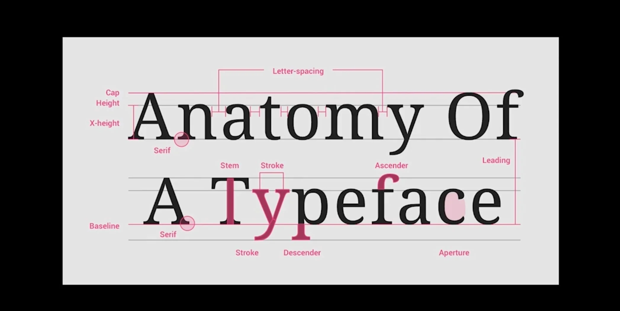
Typography, in design, is the art and technique of arranging type to make written language legible, readable, and appealing when displayed. It can create a visual hierarchy, convey emotion and tone, and direct the reader's attention. A graphic designer is responsible for selecting typefaces, sizes, colours, and spacing to communicate the message effectively to their audience and this needs to be considered in the design. For instance, using bold, sans-serif typefaces with minimal spacing can convey a modern, minimalist aesthetic, while elegant, serif typefaces with generous spacing can suggest a more formal, traditional tone. Moreover, typographic conventions, such as capitalisation, punctuation, and alignment, can significantly impact the readability and interpretation of a text. So a designer must consider key points at the project briefing stage such as tone, legibility/readability, and brand recognition at the initial briefing stage.
Overall, the design and typography of a text can significantly impact how it is perceived and understood by readers. By making intentional choices about typography and design, graphic designers can help communicate the text's intended message more effectively.


