Week 11: Workshop Challenge: What Lies Beneath?
Your Task
Case Study 1: Take one story to see how it is reported globally. Collect three versions of the same story from three different countries. How is it reported? Headline? Text? Unpacking meaning and distorting the meaning.
Case Study 2: Take a brand and look at how it is delivered in different countries, e.g. alcohol, tobacco, transport, cars. Is it symbolised in a different way? Why might colour or typeface have been changed? Does it work at a local level and does it work at a global level?
Task: Please explore Case Study 1 or 2. Collect visual examples and upload them onto your blog and onto the ideas wall. Debate your opinions with your coursemates – ensure you contribute and incorporate this into a short 500-word written critical review in your blog. Consider the impact the media has on your understanding of visual signs and symbols relating to that piece.
These case studies explore how society is manipulated by a message and how graphic design is deployed.
Week 11 - Workshop Challenge. Case study 1 - How a story is reported globally.
I decided to choose Case Study 1 as my workshop task this week. I think there is never a dull moment in the news in the UK at the moment, and I really was spoilt for choice on what to use. also looked at the structure of a front page visually.
There are great ways to communicate graphics which connect with their readers that are commonly used, include:
Headlines: Used to grab the reader’s attention and communicate the essential information quickly and easily. Headlines are often bold and large and use simple language.
Photographs: Another essential part of newspaper front pages. They can be used to tell a story, illustrate a point, or add visual interest.
Infographics: Often used to explain complex topics or to present large amounts of data in a way that is easy to understand.
Charts and graphs: Used to illustrate trends, compare data, or show the relationship between different variables. Charts and graphs can be used to make complex information easier to understand.
I choose Brexit as my News story simply because there is so much information (and opinions) on it!
Examples of a great newspaper front page editorial layout
Case Study 01: Take one story to see how it is reported globally
Collect three versions of the same story from three different countries. How is it reported? Headline? Text? Unpacking meaning and distorting the meaning.
I decided to take ‘Brexit’ as my story and see how it was reported globally when Great Britain left the EU. British newspapers played a significant role in the Brexit referendum. Most newspapers favoured leaving the EU, with the Daily Mail, The Sun, and The Daily Express being the most vocal supporters of Brexit. These newspapers used various visual techniques to promote their message, including bold headlines, patriotic imagery, and simple language.
The visual techniques used by these newspapers were effective in promoting their message. The bold headlines, patriotic imagery, and simple language were all designed to appeal to voters who were undecided about how to vote in the referendum.
Ultimately, the Leave campaign won the referendum by a narrow margin. The visual techniques used by the pro-Brexit newspapers likely played a role in this victory.
UK Brexit front cover - Overview
The UK press and the global press reported Brexit very differently. In the UK, the press was primarily divided along political lines, with pro-Brexit newspapers giving more coverage to the Leave campaign and pro-Remain newspapers giving more coverage to the Remain campaign. This was reflected in the tone of the range, with pro-Brexit newspapers often being more pessimistic about the EU and pro-Remain newspapers often being more positive.
I decided to show 2 different perspectives from Political bias.
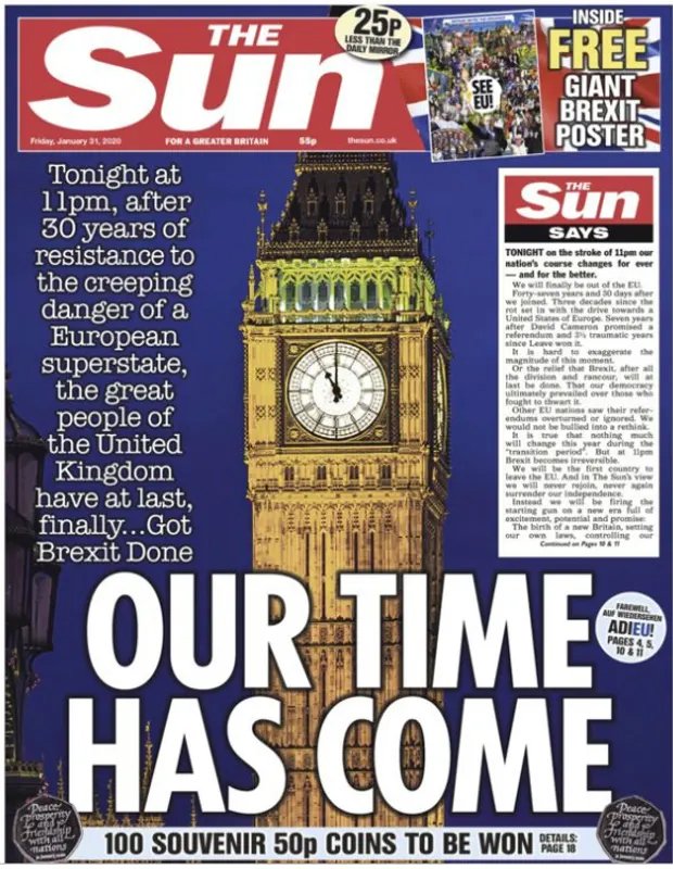
The Sun (pictured above)
This cover design is bold and full of patriotic clichés. The photograph of Big Ben takes up the full page against a blue background which compliments the red in the mast header and the Union Jack. The headline is bold and punchy is white against the blue background (again Union Jack colours).
The Guardian
A very different perspective from another UK paper, again with a full page images showing the white cliffs of Dover and a sandcastle with a union jack on looking rather sad and alone. The supporting headline is relatively small on the page and hints of pessimism compared to the bold brash headline of The Sun.
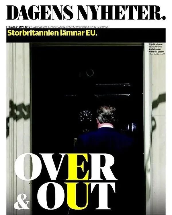
UK Brexit front cover - Dagens Nyheter (Sweden)
Dagens Nyheter (abbreviated DN), is a daily newspaper in Sweden. It is published in Stockholm and aspires to full national and international coverage.
This is their front cover from the day Great Britain voted to leave the EU. It is a very different contrast to the UK papers. Overall the tone is very sombre with a dark photo. The main image is David Cameron with his back turned. Could this be very symbolic of him turning his back on the EU?
There is a clever play with the Main heading ‘Over and Out’ with the EU letters being bought out in yellow.
Overview
The whole front page is just one photograph which is dedicated to this story, shows its importance in the content. Visually the tone is very different from the UK coverage, and indicates regret and uncertainty.

Case Study 01: Take one story to see how it is reported globally
Collect three versions of the same story from three different countries. How is it reported? Headline? Text? Unpacking meaning and distorting the meaning.
I decided to take ‘Brexit’ as my story and see how it was reported globally when Great Britain left the EU. British newspapers played a significant role in the Brexit referendum. Most newspapers favoured leaving the EU, with the Daily Mail, The Sun, and The Daily Express being the most vocal supporters of Brexit. These newspapers used various visual techniques to promote their message, including bold headlines, patriotic imagery, and simple language.
The visual techniques used by these newspapers were effective in promoting their message. The bold headlines, patriotic imagery, and simple language were all designed to appeal to voters who were undecided about how to vote in the referendum.
Ultimately, the Leave campaign won the referendum by a narrow margin. The visual techniques used by the pro-Brexit newspapers likely played a role in this victory.
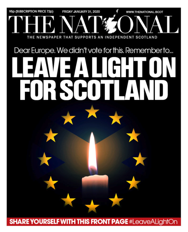
UK Brexit front cover - The National (Scotland)
A British newspaper with a very different perspective. The National, a paper that supports an Independent Scotland have come from a very different regretful angle.
The headline is written like a letter to Europe showing unity with the EU rather than their neighbours in England.
Dear Europe, We didn’t vote for this…
The full page image front cover features a very symbolic image, of a burning candle in front of the flag of Scotland and the EU flag with the title “Leave a light on for Scotland.”
Overview
Visually very dark and sombre and a very different tone from the UK patriotic coverage the cover is mainly black with white bold typography.

Reflection:
Politics, especially Brexit, can get very heated, so I have tried to remain impartial in my viewpoint.
The visual techniques used by all of these newspapers were effective in promoting their message. The bold headlines, patriotic full-page imagery, and simple language in their headlines were all very similar to each other, whatever their political stance.
Week 11 - Workshop Challenge. Did key graphics and photographs influence Brexit?
Working in design I know how images can be airbrushed, distorted or misleading, I have taken to questioning everything I see in print or digital media.
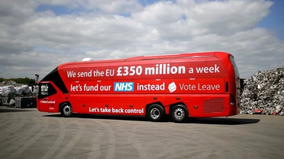
But as the frenzy in reporting led to the Brexit vote, the public was flooded with images of migrants and graphics on the Leave campaign bus claiming to ‘take back control’. The 2ft high letters on the bus graphics with a bold statement, that the money sent to the EU could be spent on the NHS was misleading and has since had a scathing attack by Britain’s data watchdog.
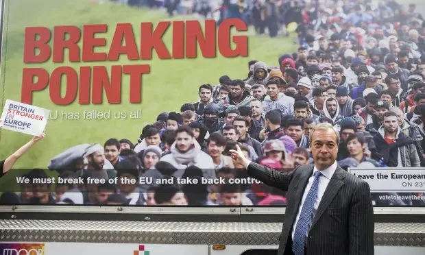
The Breaking Point photograph, Ukip used in their Brexit campaign, was taken totally out of context and was taken by a photographer documenting refugees escaping war torn Syria.
The photographer Jeff Mitchell was sent to record the event of the migrants reaching the Croatian border and photographed as they were ‘kettled in’ while awaiting showing their documentation. UKip used the image in the wrong context to strike fear into UK citizens that they were coming to take their jobs. Most people could see this was clearly not a group coming to the UK. They aren’t sucked in that easily. This makes it almost comical for Ukip, because it’s had completely the opposite effect they thought it would have.
Pictures: Graphic design and politics - Did the big, bold graphics on the side of the ‘leave’ bus convince voters that this was a trusted source of information?