GDE720 - Week 1: Photography and GeoType Page
Photograph a broad selection of typography and lettering examples (minimum 10) that illustrate what you believe define the identity of your hometown, nearest city or surrounding area. We want you to research and collect a broad range of examples taken from historical and contemporary reference points.
Your collection should be edited down to five examples you think best reflect the identity of your location.
Note down the exact location to include:
1. street name, building number, city/town, area postcode and, if possible, the
2. longitude/latitude on Google Maps
as we want you to log your examples on the GeoType page on the MA Graphic Design website.
The aim of this task is for us to curate and examine vernacular letterforms. Please work hard to collate diverse examples, such as hand-drawn, printed, weathered, worn, industrial and pristine. We want to see you looking from ALL perspectives and NOT just street level.
Analyse how effectively the examples of type design communicate place and the identity of that area, and write a short (100-word) description for each letterform. Please consider its material make-up, role, use and application, with regards to its location, eg a weathered sign over a disused shop, which would suggest the changing fortunes of the high street, or the industrial letterforms in a new bar, which suggest gentrification.
Week 01: Workshop challenge -
Lettering and typography examples that define the identity of my hometown
Typography - my fav! What a great start for week one’s workshop challenge. My studio is in the old part of East Grinstead town I was sure there would be some great historic signage to be discovered. So I took a stroll to REALLY look closely and discover examples from the historical and contemporary signage on the High Street which leads into London Road.
My analysis:
It didn’t take far to walk to discover the juxtaposition between the traditionally hand-drawn, letterforms along East Grinstead's 15th Century High Street with the modern and vibrant display of colourful plastic and neon signs lining London Road. I felt this not only reflected a visual contrast but also served as a poignant symbol of the economic downturn, with the shift from historical charm to a proliferation of betting shops, pound shops, vape shops, and fast food eateries, signalling the transformation shaped by financial challenges.
The High Street, East Grinstead
London Road, East Grinstead
Fig. 1: Examples of the High Street The 15th Century part of the High Street is blended with sympathetic colours and cliched Black letter style typefaces to emphasise the by gone era.
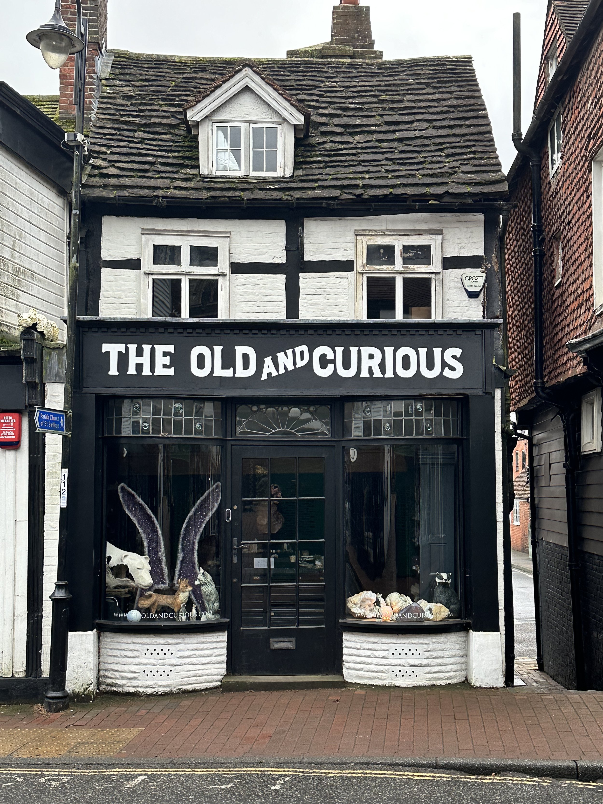
Fig. 3: The Old and Curious, High StreetSympathetic to its surroundings, hand-painted signage of the High Street shops.
The longest title on the High Street - It’s a good job that this is a double-fronted shop otherwise how could you have fitted the long title underneath in!
Fig. 2: Examples of the London RoadTurn the corner to a contrast of brightly coloured plastics, and backlit signs from recognised high street brands of charity shops, pound stretchers, betting shops and fast food eateries. Is this a poignant symbol of economic downturn?
Examining vernacular letterforms - inital thoughts
Question
What is the visual narrative of the life associated with these places? Do the typographic differences interpret the cultural and economic differences in local life in East Grinstead?
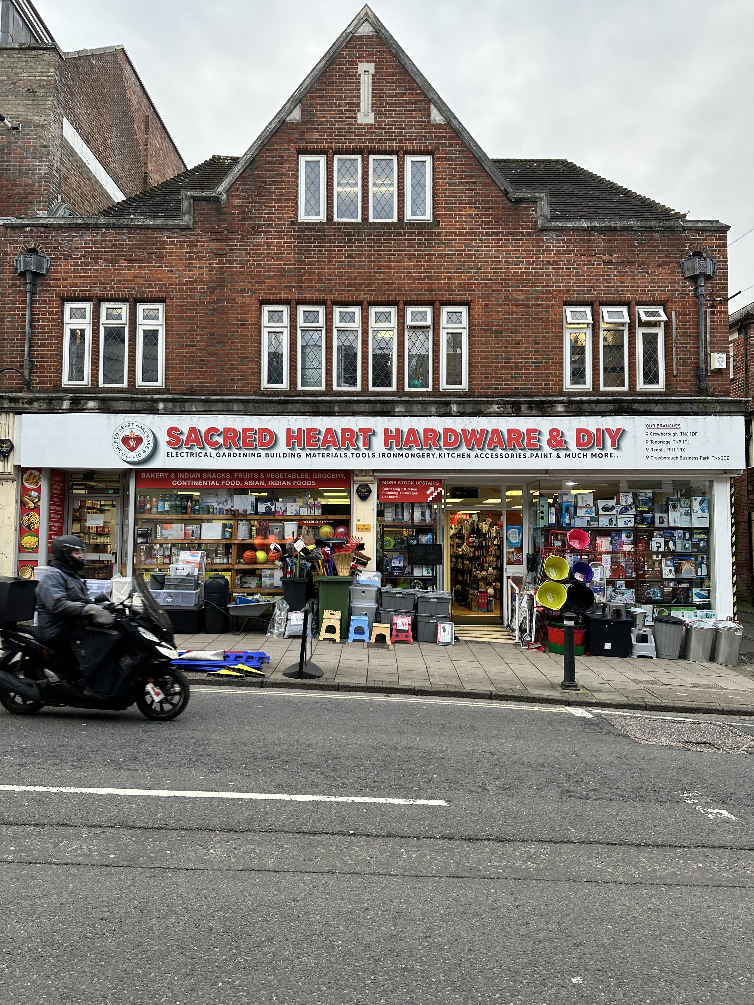
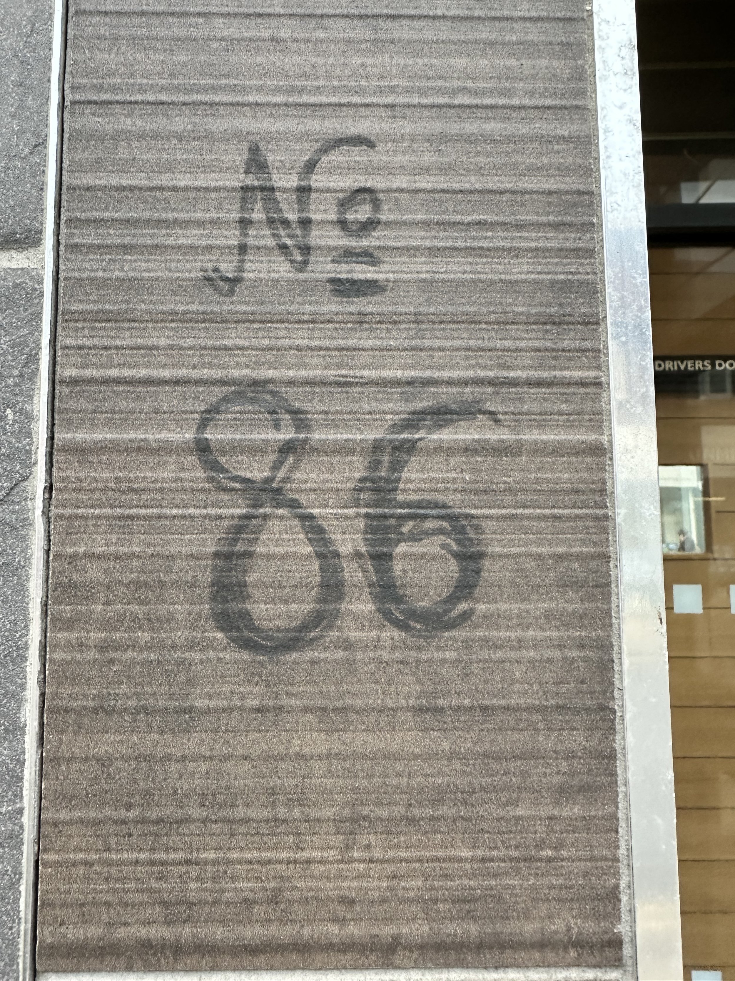
Fig. 6: Sacred Heart Hardware Store, London RoadFig. 9: No 86 London Road, felt pen typographic serif consideration I love this. A little bit of though went into it before writing the numbers in pen. Writing on tile by the door of above a shop flat on London Road.
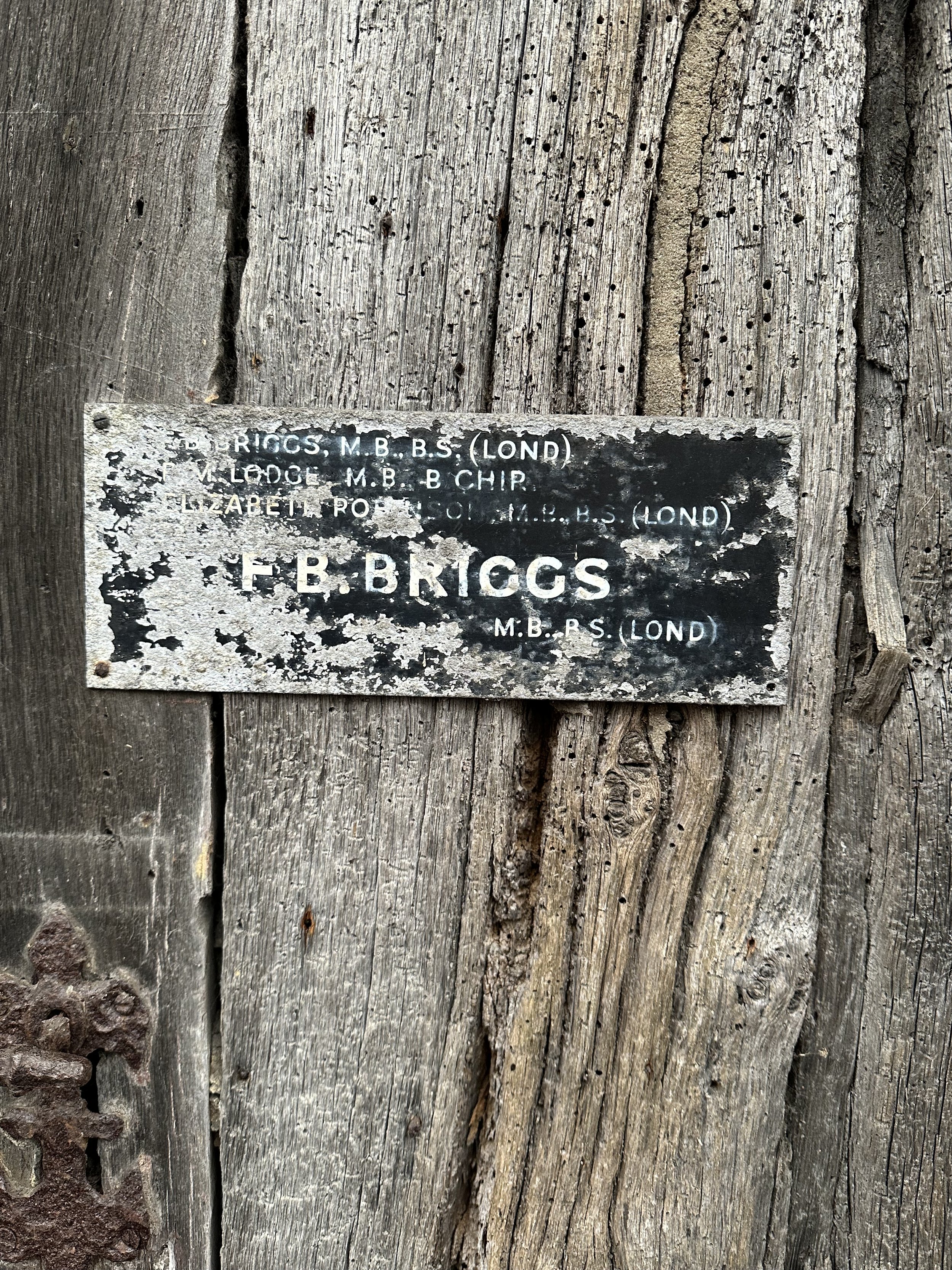
Fig. 4: Hidden High StreetI love the mystery of this worn doorway plaque. What is it’s story? Who lived there and from when?
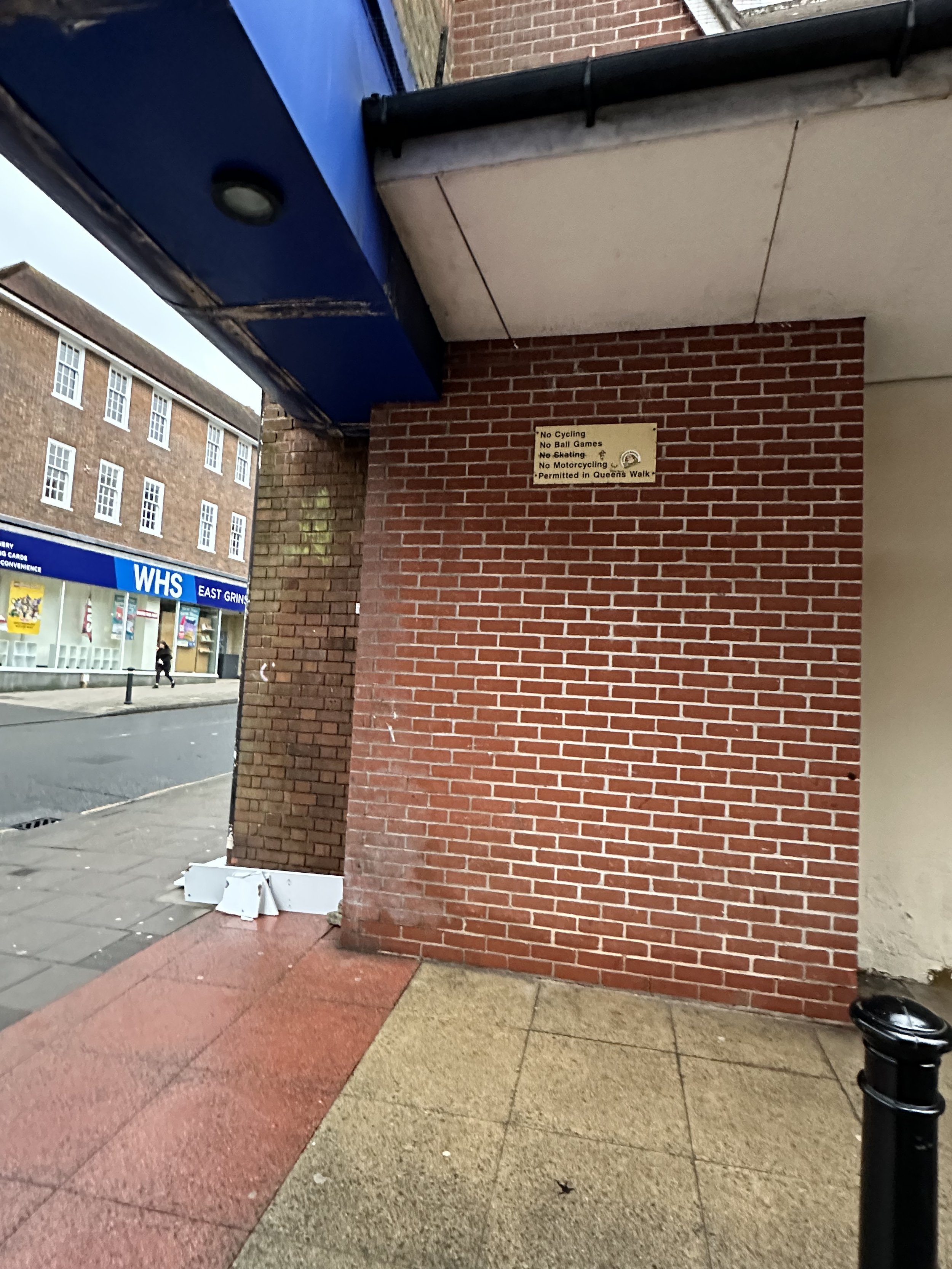
Fig. 7: Queens Walk signageWho is this sign for? It’s way above head level, so not legible. I must have walked past it countless times and never seen it.
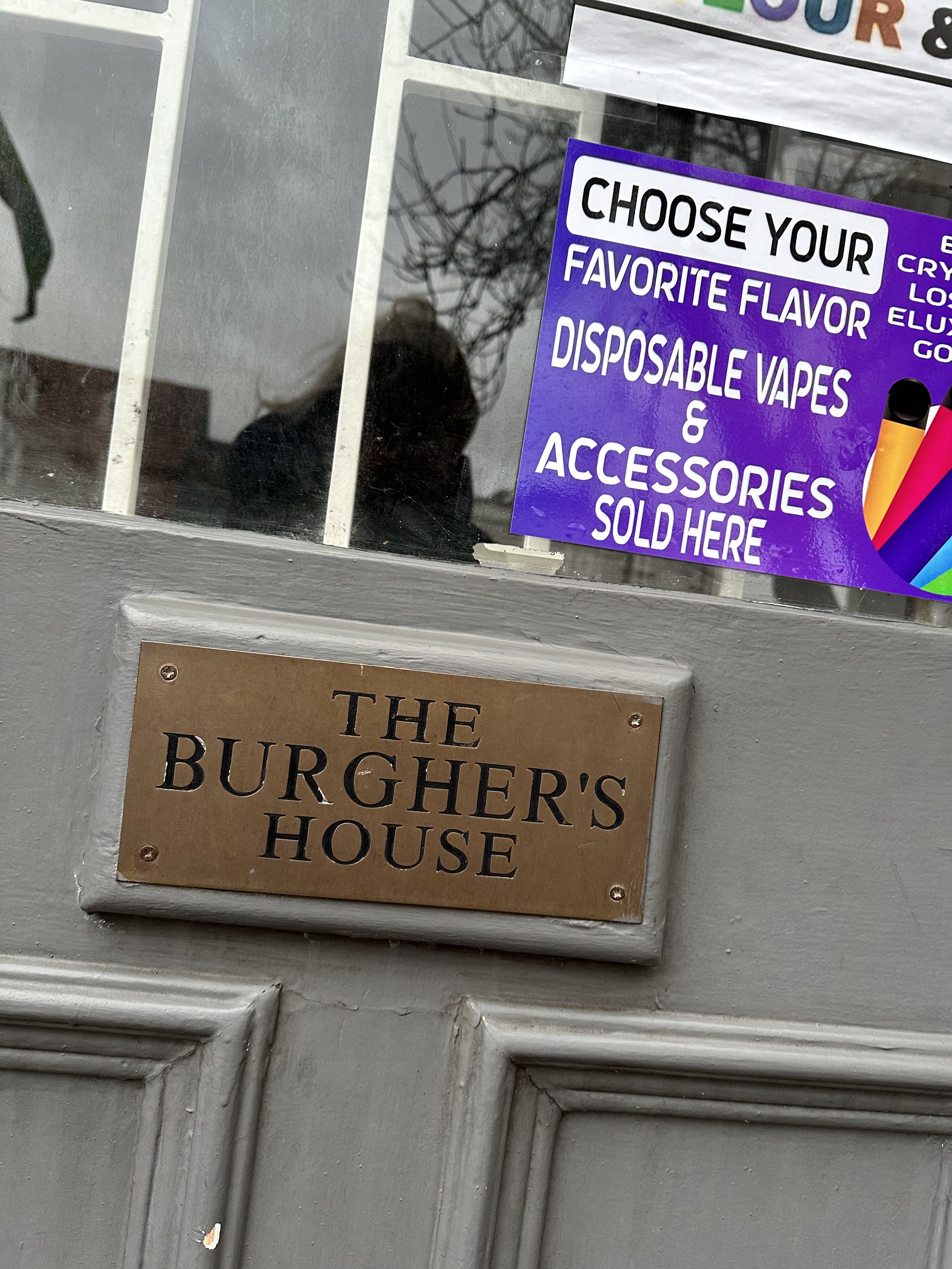
Fig. 10: High StreetAs the independent boutiques are replaced with vape shops, the plastic stickers with ‘color’ and ‘flavor’ show a sign of the times.
Fig. 5: Ghost signs, High StreetDesperately looking for some evidence of ghost signs on the painted-over walls from the buildings off the High Street
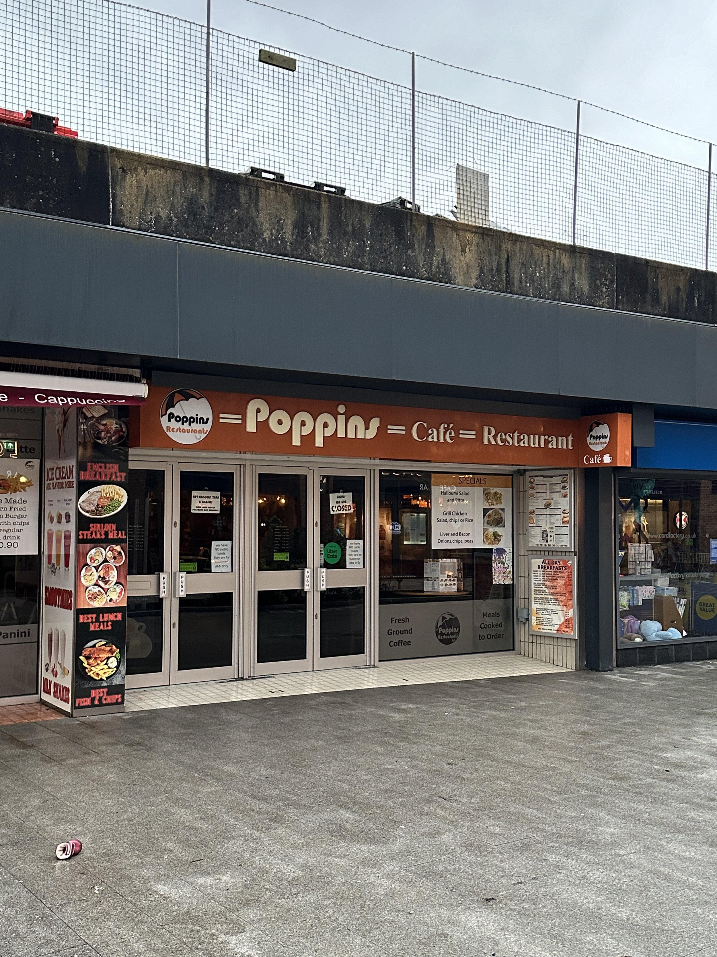
Fig. 8: Queens Walk signageWow, there is a lot going on here typographically! From the initial sign in 2 different fonts to the photographed food menus and text surrounding it.
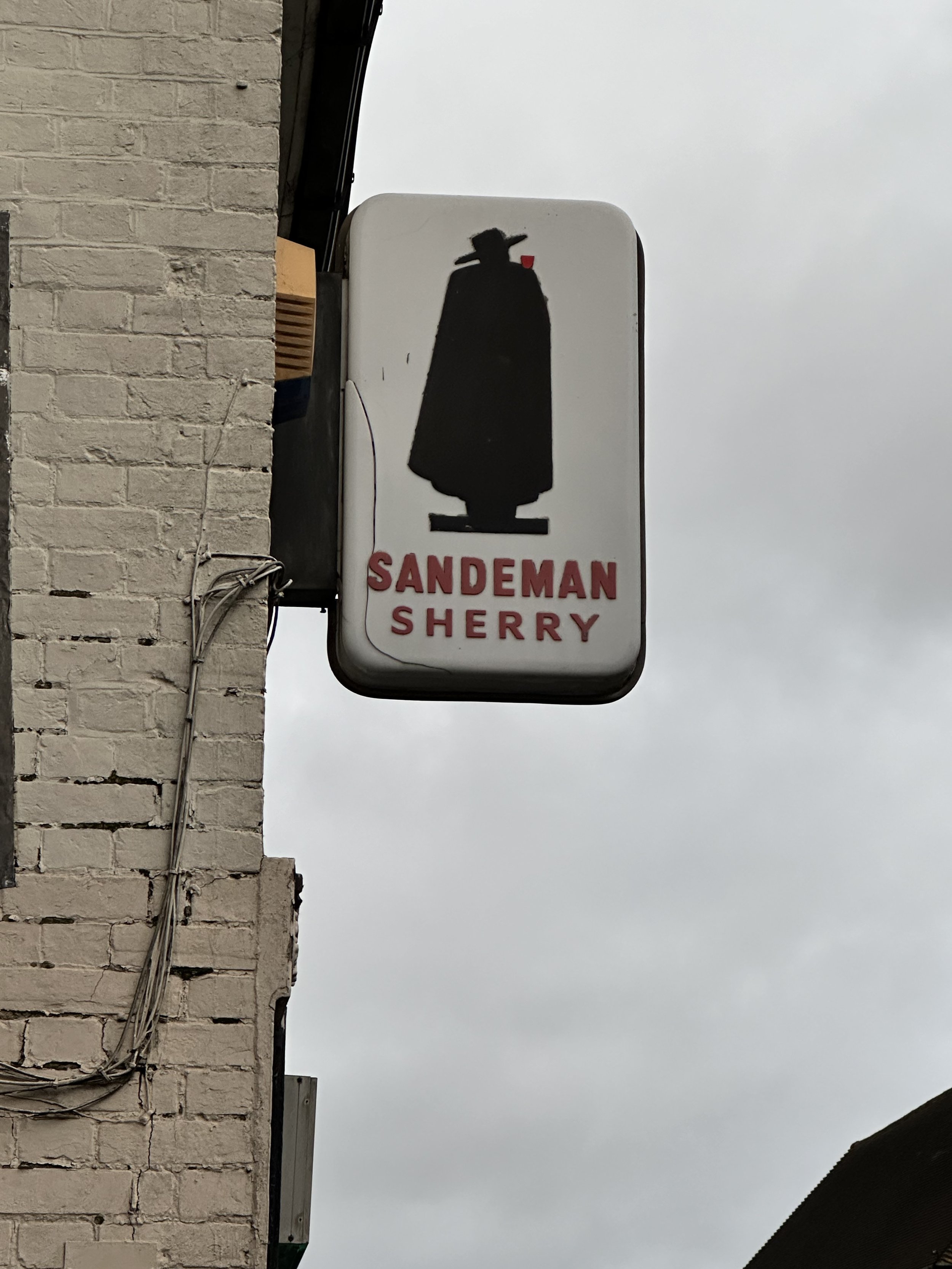
Fig. 11: Armstrongs Off Licence, London RoadThis Sandeman Sherry advertising signage reminds me of the 1970s adverts.
My final 5 lettering examples
Evening Standard - Ghost signage
Location: 19 London Road RH19 1AG, Coordinates 51.13198° N, 0.02113° W
Discover
Look up! I almost missed this. I don’t know how many times I have walked past this and never seen this before. But after a visit to the local museum, to crosscheck historical references and information, led me to discover this painted advertisement. This ghost sign is the only evidence of what was previously the Evening Standard papers local office. Hardly visible anymore, the paint is weathered and worn all that is left of a bygone era.
References
https://ghostsigns.co.uk/publications/reading-list/
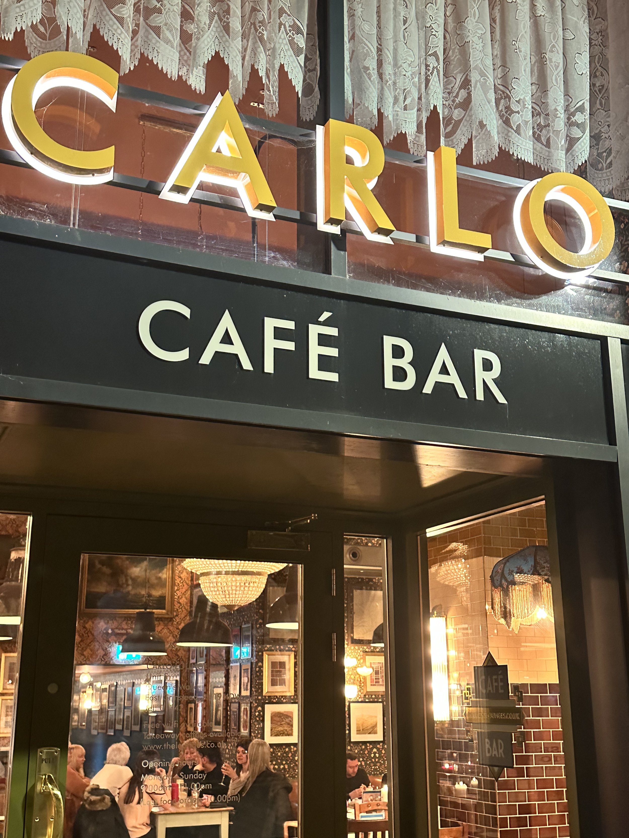
Fig. 12: Ghost sign, London RoadCarlo Lounge - Elegant sans serif typeface
Address: Unit E, Queen Walk, East Grinstead RH19 1AL
Coordinates 51.12484° N, 0.000922°W
Discover
This cafe/restaurant location is on the newly built side of Queens Walk which has seen significant investment with the development of new modern apartments with trendy cafes, and gyms under high-rise flats, a significant improvement against the previous 70s architecture. I love this signage and typography, not just for its elegant sans serif, and fretwork with a backlit glow, standing out as a beacon of optimism in what was once a run-down arcade.
Interesting fact
Carlo Lounge is part of a small chain emerging in the South East. When naming their restaurants they try to have a connection to their locality. So the East Grinstead cafe is named in honour of the carol Good King Wenceslas, which was written in East Grinstead. So Carlo is a play on carol.
References
https://thelounges.co.uk/carlo/
The Whitehall Building
Address: 45-53 London Road, East Grinstead RH19 1AL
Coordinates 51.12561° N, 0.000893° W
Discover
Looking up to see this stylish facade of the 1930s in a former music hall and leading entertainment venue in the area. This arc deco building has its name etched into the stone. Incredibly elegant in its heyday and a reminder of a bygone era. Through years of neglect, it has lost the white stone finish and is almost invisible to the naked eye.
Interesting fact
On 9 July 1943, when this building was a cinema, a German plane on its way out of London after a bombing raid, dropped its remaining load raid of WW2, seeing 108 people killed and 235 injured.
References
https://www.visiteastgrinstead.com/whitehall-building-london-road/
Fig. 14: Stone typography of Whitehall Building The Old Mill
Address: 45-53 London Road, East Grinstead RH19 1AW
Coordinates 51.12552° N, 0.000806° W
Discover
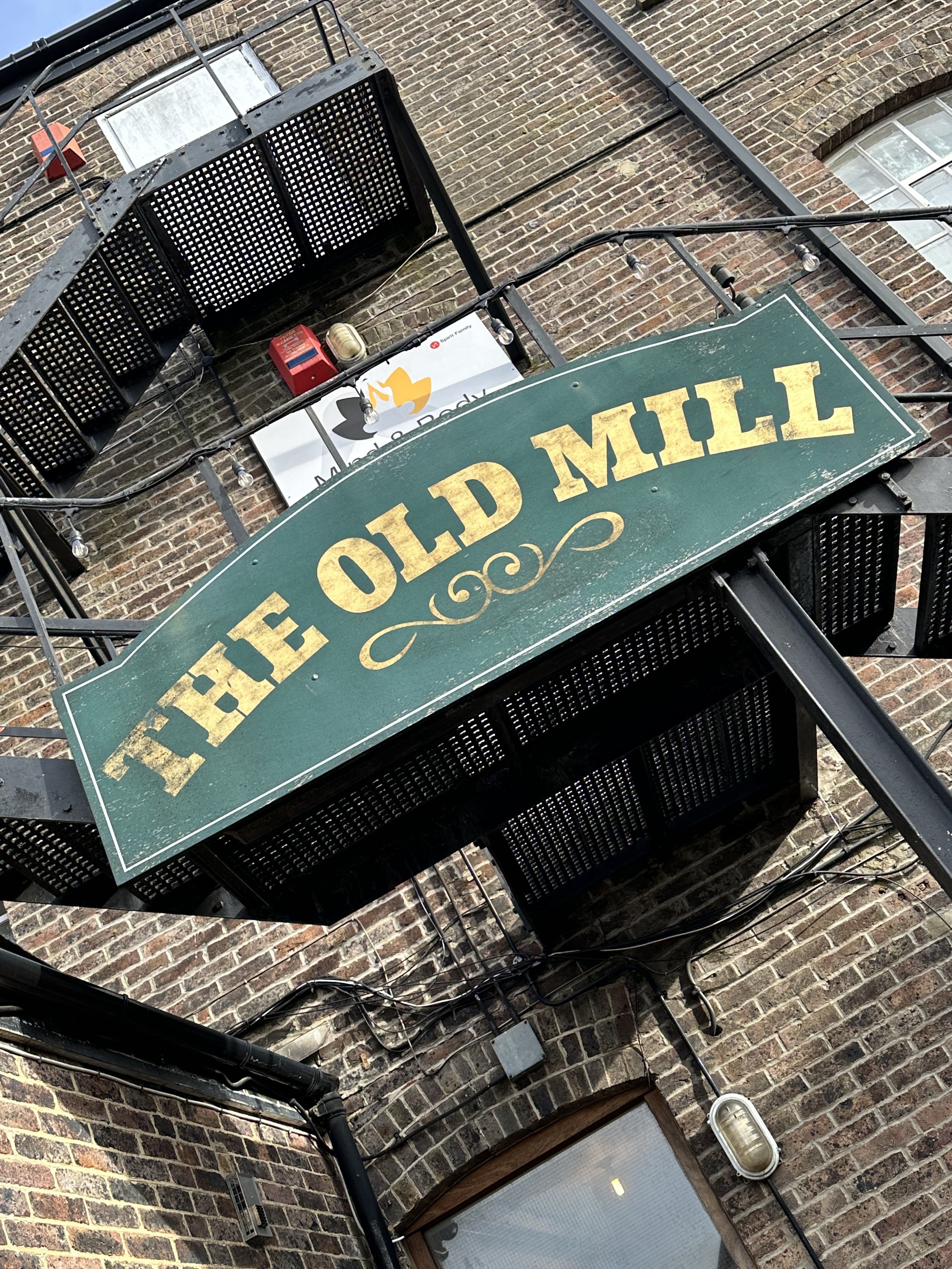
Apart from its name, there is no evidence that this was ever a working mill, although I was told that it was a paper mill and warehouse. Set back from the High street, I found this weathered golden hand-painted signage. It is slightly worn and the typeface weight is set in the style of a slab serif font familiar with the nineteenth century. The building has now been split into offices to let with a micro brewery underneath.
References
https://www.eastgrinsteadmuseum.org.uk/exhibition/history-of-our-town/
Meridian Line marker, East Court Estate
Location: East Court, College Lane, East Grinstead, RH19 3LT
Coordinates 51.12916° N, 0.0001161° W
Discover
This historical stone plaque was set into the terrace at East Court Mansion in 1977 to commemorate the Silver Jubilee of Queen Elizabeth II. Since 1884, the Prime Meridian, also known as the Greenwich Meridian Line, has served as the standard time measurement. Extending from Pole to Pole, its renowned celebration takes place in Greenwich, London. What’s less recognised is its passage through East Grinstead.
References
https://www.visiteastgrinstead.com/local-attraction/millennium-stone-meridian-line/
WHSmith Signage - we are the 1%
Location: 14 London Road, Coordinates 51.12460° N, 0.000841° W
Discover
I had to include this, not because I like it, in fact, I think it’s pig ugly, but because it caused such a stir on Padlet when I mentioned it. According to Creative Review this was trialled in only 1% of their UK-based stores.
For this version, they have moved away from the popular serif font and to a sans serif, block caps which look very similar to the NHS logo with an also identical colour palette. The tracking on the WHS looks ‘squished’ in comparison to the words ‘East Grinstead’.
References
https://www.creativereview.co.uk/whsmith-branding-trial/
Fig. 13: Carlo Lounge, Queens WalkFig. 15: The Old Mill, London RoadFig. 16: Meridian line stone plaqueFig. 11: Armstrongs Off Licence, London RoadReferences:
Websites
[12] Ghost Signs. | A London Story by Sam Roberts and Roy Reed. [online] Available at: https://ghostsigns.co.uk/publications/reading-list/ [Accessed 22 January 2024]
[13] The Lounges. | Carlo Lounge, East Grinstead. [online] Available at: https://thelounges.co.uk/carlo/ [Accessed 22 January 2024]
[14] Visit East Grinstead. | The Whitehall Building [online] Available at: https://www.visiteastgrinstead.com/whitehall-building-london-road/ [Accessed 27 January 2024]
[15] The Old Mill | [online] Available at: https://www.eastgrinsteadmuseum.org.uk/exhibition/history-of-our-town/ [Accessed 27 January 2024]
[16] Meridian Line Marker | East Court Estate [online] Available at: https://www.visiteastgrinstead.com/local-attraction/millennium-stone-meridian-line/ [Accessed 27 January 2024]
[17] Creative Review. | The curious case of the WHSmith branding ‘trial’. [online] Available at: https://www.creativereview.co.uk/whsmith-branding-trial/ [Accessed 26 January 2024]


