Phase 03 - Week 10
Research Journal
I will be working towards achieving the following learning outcomes detailed in my assignments tab including:
LO2: Contextualise - Appraise the social, political and historical contexts in which design practice operates.
LO3: Analyse - Evaluate research findings and use sound judgement that is informed by critical debate at the forefront of the academic discipline.
LO5: Imagine - Deliver appropriate and innovative ideas that embrace risk, have contemporary relevance and question the boundaries of the discipline.
LO6: Make - Select and utilise relevant tools, skills and technologies in the delivery, iteration and sustainable production of an outcome.
LO8: Design - Realise a final solution that evidences its strategic journey and clear relationship between form and function.
LO9: Communicate - Communicate effectively in a range of contexts and situations to specialist and non-specialist audiences.
LO10: Manage - Demonstrate applied planning and organisational skills to support self-directed project work and inform ongoing professional development needs.
Phase 03/Wk 10: Design Development
Project Recap - Weeks 9 - 10
Last week:
I analysed the data from my questionnaire and found that although 88.6% of local people were aware of the water found, 90.7% hadn’t used it.
I’ll read about It’s Nice That—Can neighbourhood branding projects truly serve the community? and discuss whether branding my project would give it a clear identity for recognition.
I attended Ben’s weekly tutorial - About Critical Report submissions and wrote up my notes
This week:
I’ll observe the current usage of the Jubilee Drinking Water Fountain.
Create an ‘Affinity Diagram’ as advised in my Domesika tutorials
Ideate and Prototype my app
Discover my user/personas
I’ll attend Ben’s Tutorial on Critical Report submissions. NOTE: look at the 3 papers supplied.
Observational analysis - & more questions from the council
Sitting, watching waiting… to see who uses the drinking water fountain
To examine whether the drinking fountain was being used, I decided to do some observational analysis. So, on a hot, busy Sunday, I sat down by a local café for an hour and people-watched.
For context, the drinking fountain is in an incredibly busy part of the High Street. Even on a Sunday when the surrounding Independent retail shops are closed, there is a lot of footfall at the cafes, bookshops, and restaurants. It is not far away from Forest Way, either, which is frequently used by cyclists, walkers, and families along a scenic footpath of the disused railway line.
It was a relatively busy day on the High Street, but despite sitting there for a while, nobody used it. (Although one lady came close, I think she was more curious about the fountain, as she had seen me filming and taking photos of the High Street.) I knew this was the case as had spoken to the EG Town Council in week 7.
Time lapse for observation analysis to check for usage
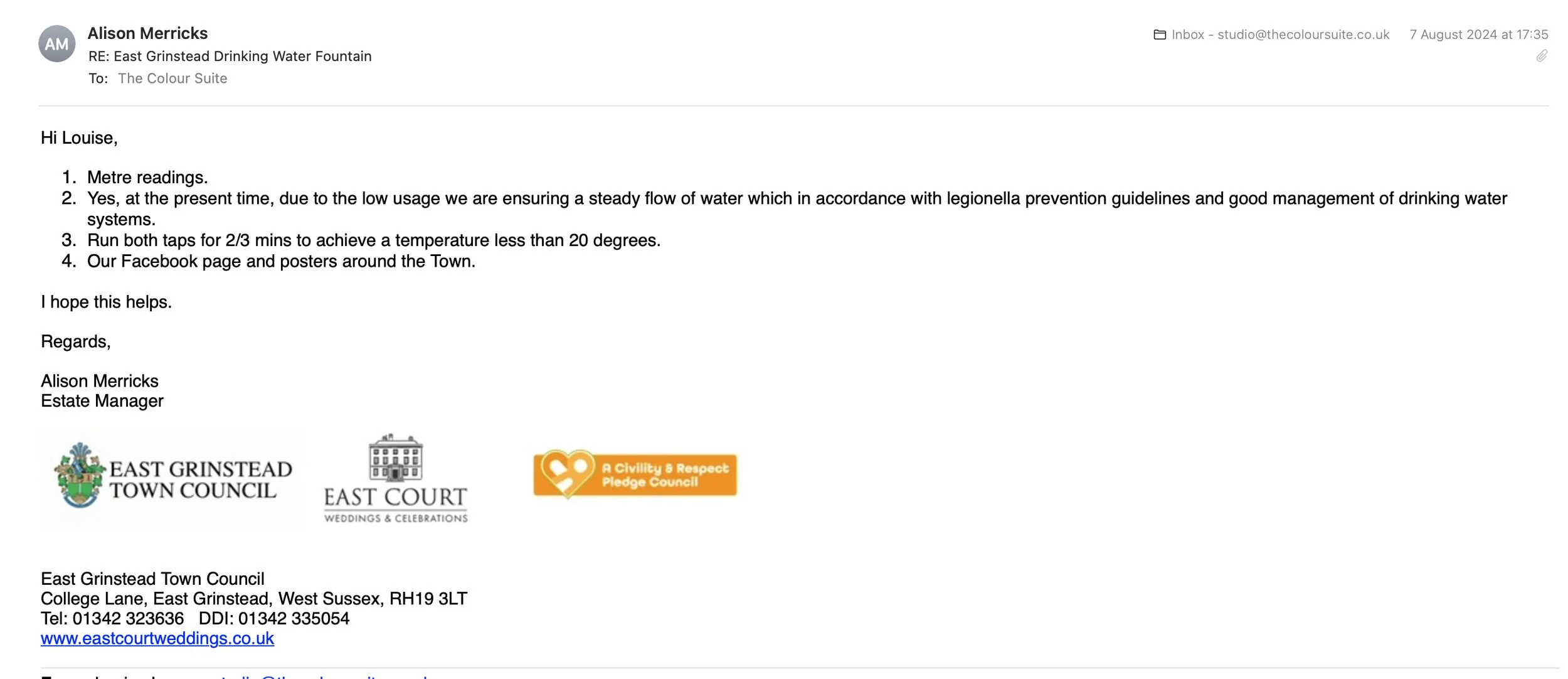
I decided to press Alison Merricks for hopefully some more answers.
Dear Alison,
I wondered if you could confirm how you can tell if it is or isn’t being used. Is that why the flushing-out team are involved? What do they do?
What channels of social media are used?
Could you ask me some more questions at a time that is convenient for you? I'm happy to visit the council offices.
From this reply, I was quickly able to establish
1. The fountain was being monitored for regular use, so there was a way to gauge its success
2. It was being monitored and checked regularly to ensure the water was safe to drink
3. There were posters advertising it.
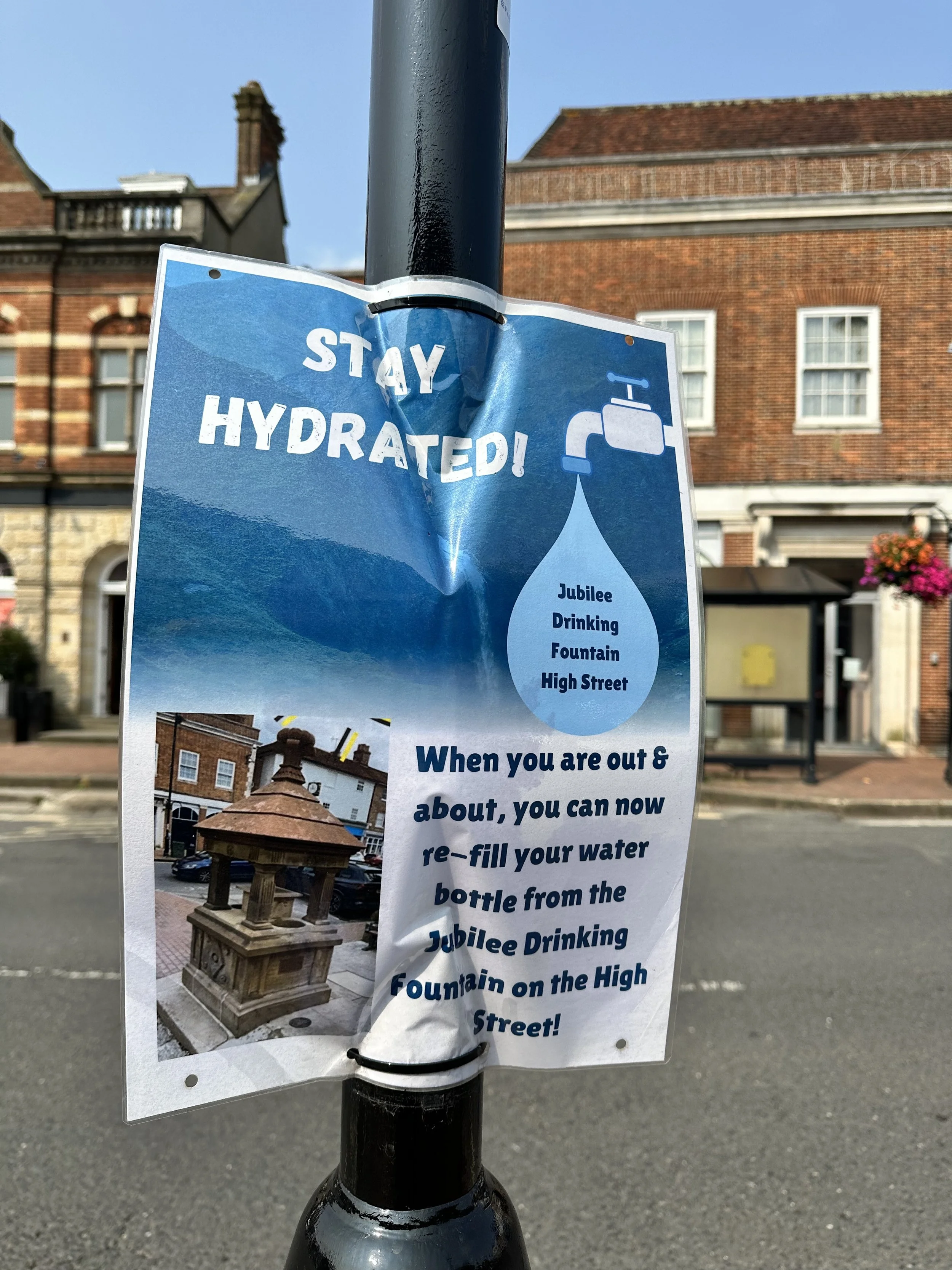
I decided to look for these posters around town, and it wasn’t long before I found one (albeit a bit pointless).
Current marketing - advertising the Jubilee Drinking Water Fountain
Advertising the Jubilee Drinking Water Fountain
When I asked EGTC how they were currently advertising the fountain, I found the advert for the Jubilee Drinking Fountain opposite the fountain — which I thought was a bit pointless as you would already be there and have a receptacle to fill up from!
Online, I found the only way to access any advertising was through the EG Town Council's Facebook page, which you had to look for.
Further Analysis - Crucial in the early research process
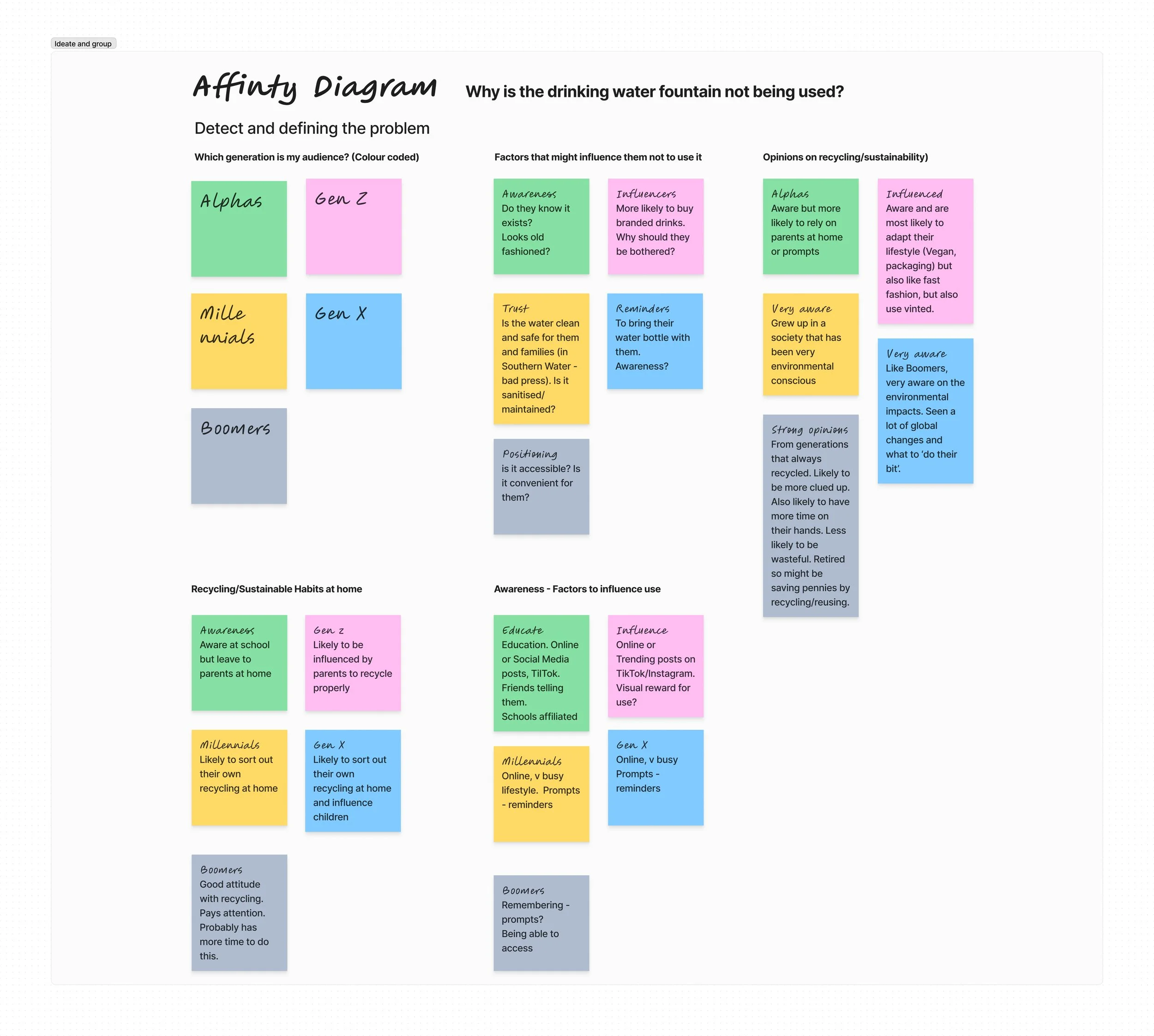
Creating an affinity diagram was the easiest way to identify and present the best solutions. If I’m honest, when I created an app in an earlier module, I skipped past all this process and concentrated on the visual aspect. But this is SO important in the early stages of the UX design process to help organise my qualitative data.
I’m hoping this will help reveal patterns and insights, so I can make any complex information more manageable to facilitate my decision-making. Based on the questions I had received answers to, I colour-categorised them into audiences and their answers below in Figma:
Creating this diagram made it easier to see a pattern, and I could see the problem. From this, I refined my question to include my target audience - Gen Z.
Question
“How can I influence Gen Z within my community to adopt more sustainable practices by regularly using the restored water drinking fountain instead of single use plastics.” *
*I’m sure this may change at a later stage, but this is the question I’m sticking with for now!
Thoughts and ideas
My main concern was connecting the link between engaging with the community to use the ‘drinking fountain’ and ‘building a more sustainable mindset’ by stopping single-use plastics. But I realised this would be a big ask, and I needed to find more examples or research on how this could be done.
Define - Identifying my audience
Creating personas
To identify my target audience, I needed to focus on who I was designing for to avoid stereotypes and biases.
From my affinity diagram, I could match the personal to specific tributes and behaviours. I based my personas on a mini scenarios on some of the Gen Z I had connected with in my:
Interviews
Focus Groups
Surveys
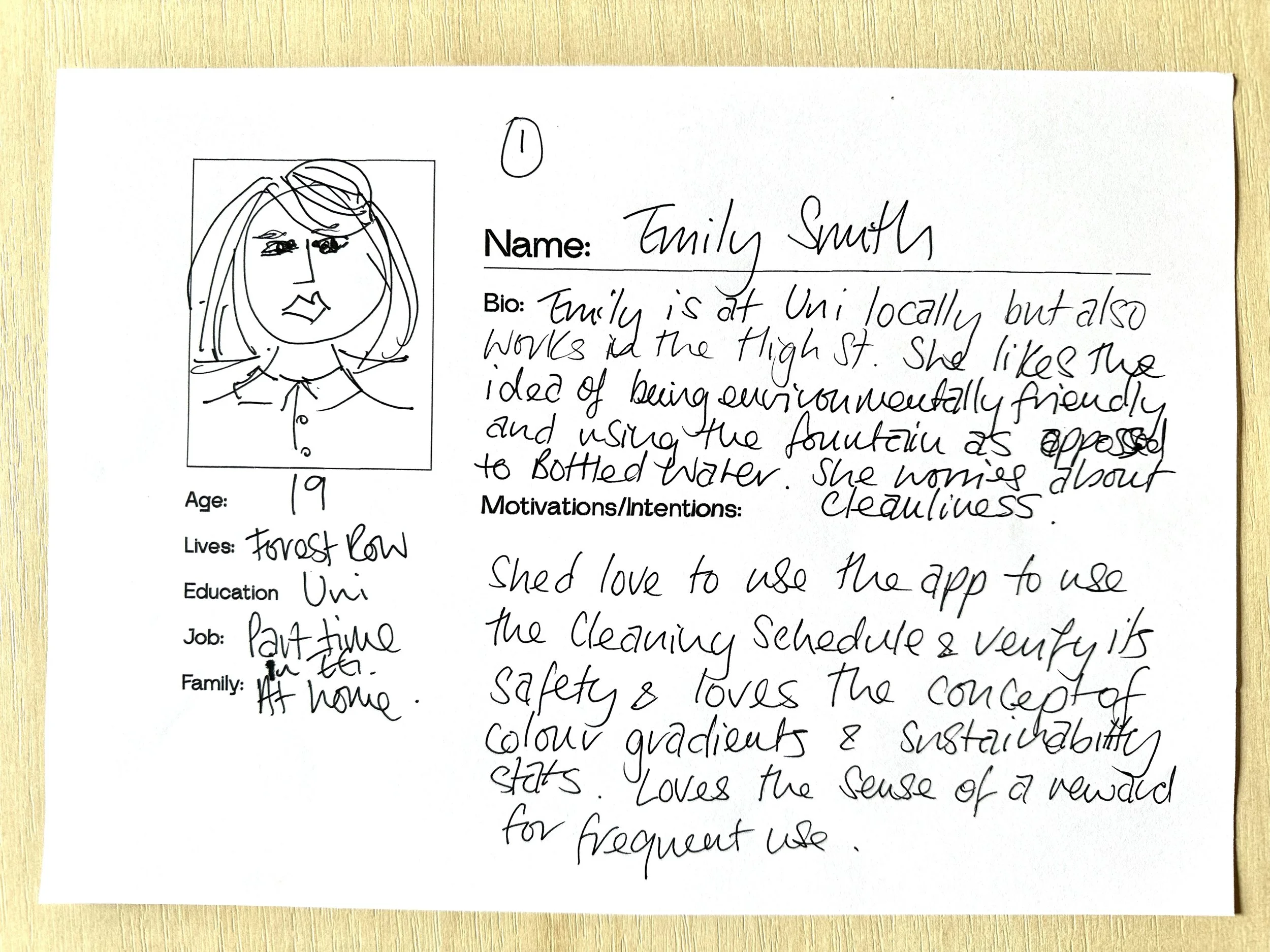
My 3 personas were based on the Gen Z audience living in or around East Grinstead, Forest Row on Felbridge and are regularly in the Town centre, specifically the High Street. These were my initial sketches.
Gen Z personas
Persona 1: Emily Smith
Scenario:
Emily often commutes from Forest Row to East Grinstead for her university studies and part-time job. She’s conscious about sustainability and carries a reusable water bottle, but sometimes forgets to fill it. When she’s in the town centre, the Jubilee Fountain could be a convenient option, but she’s hesitant to use it because she’s unsure about its cleanliness. She finds it inconvenient to check the water fountain’s status or maintenance record, so she avoids it altogether.
Motivation for using the App:
Emily would use an app to track the cleaning schedule of the fountain and verify its safety. She’d love a feature where she could see real-time user reviews or check a "last cleaned" stamp to ease her concerns about hygiene. With these reassurances, she’d start using the fountain to fill her bottle, reducing her plastic use and contributing to her sustainable lifestyle.
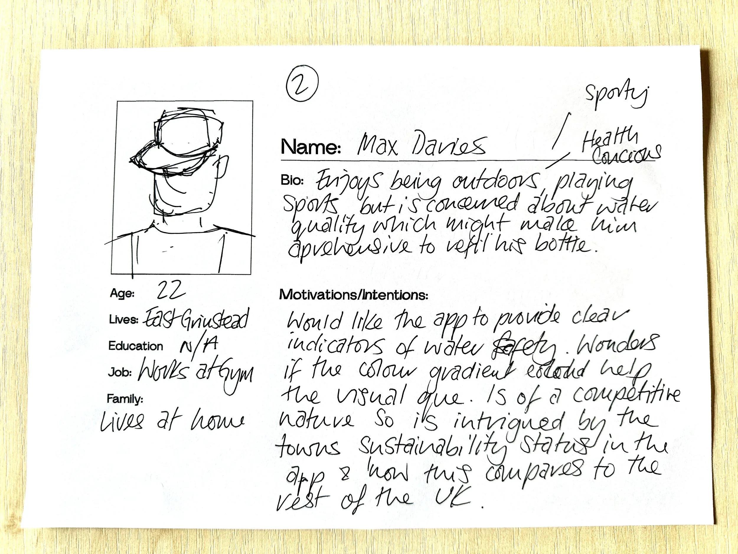
Persona 2: Max Davies
Scenario:
Max lives in Felbridge and comes into East Grinstead regularly to hang out with friends and play football at the local sports fields. He’s health-conscious and committed to reducing plastic waste, but he’s skeptical about the hygiene of the public water fountain. He also doesn’t think the fountain gets used enough, which makes him less confident in refilling his water bottle there.
Motivation for using the App:
Thanks to its real-time updates, the app would motivate Max by its ability to provide clear indicators of the fountain’s water safety. The gradient lighting system would be a huge draw for him, as it gives an immediate visual clue that the fountain is safe and well-maintained. He’s also intrigued by the town’s sustainability stats in the app, especially seeing how his community stacks up against others in the UK. This data visualisation would make him feel like his individual contribution, alongside others, is making a measurable impact.
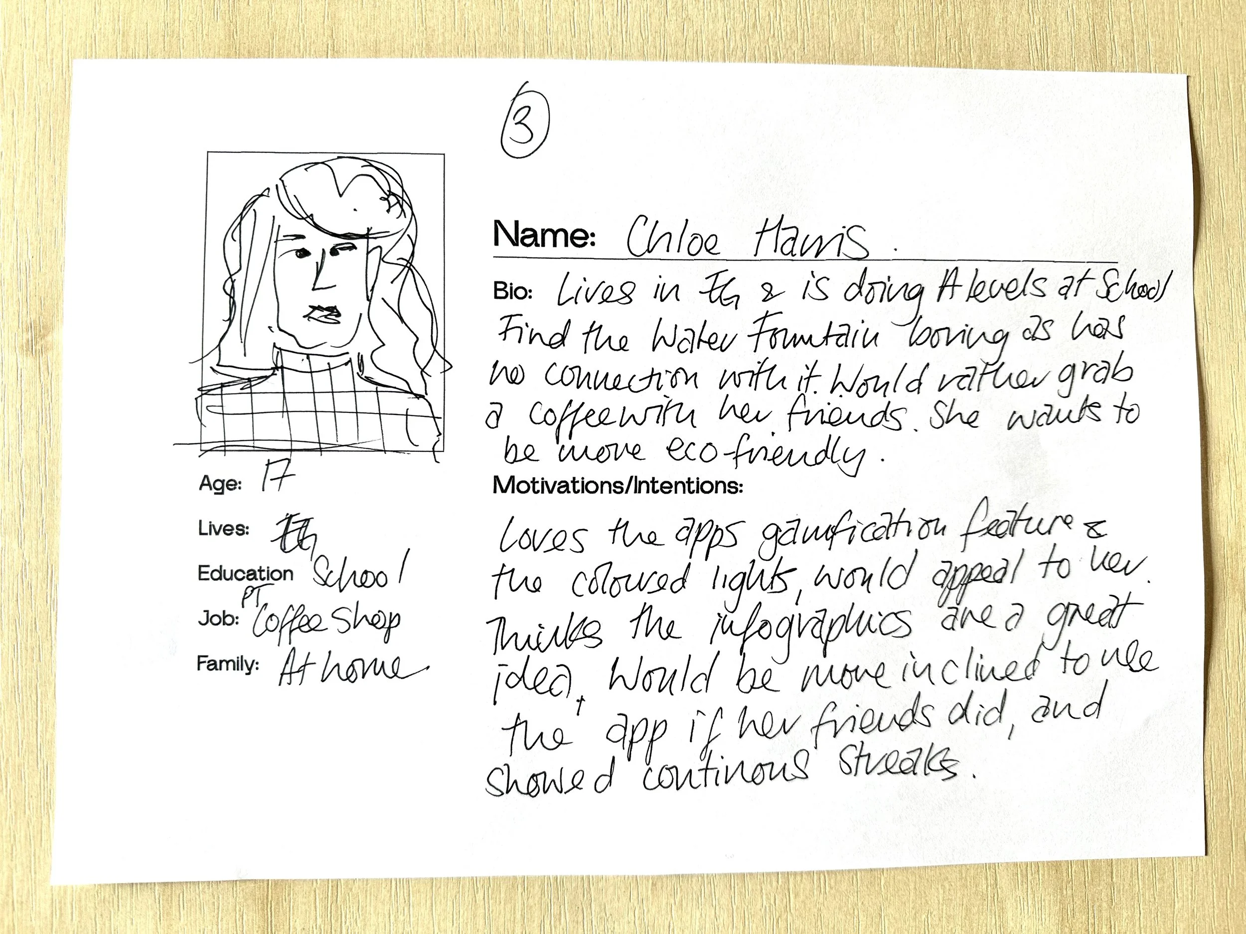
Persona 3: Chloe Harris
Scenario:
Chloe, who lives in East Grinstead, spends much of her time in town after school, hanging out with friends, shopping, and stopping by cafes. She wants to be more eco-friendly but often defaults to buying plastic bottled drinks. She knows the drinking fountain but has never found it cool or fun to use, and she feels unsure about its cleanliness.
Motivation for using the App:
With its colour-changing lights, the app’s gamification feature would appeal to Chloe. Based on her engagement, she would love to see the fountain glow in different colours, making refilling her bottle a fun and social experience. The app’s simple infographics would give her insight into how she and her friends contribute to the town’s sustainability efforts on social media, making the entire experience more fun and interactive.
Summary of the App’s key motivations for each Persona:
Emily Smith: Motivated by real-time cleaning/hygiene updates, colour gradients, and sustainability stats. Emily is eager to feel connected to an eco-conscious community while being rewarded for regular usage.
Max Davies: Max values the app’s safety alerts, visual lighting clues, and sustainability comparisons, as they give him the assurance he needs to trust the fountain and the satisfaction of contributing to a greener town.
Chloe Harris: Chloe is drawn to the app’s fun, interactive features, like the gradient lights and visual statistics, which turn a mundane task like drinking water into a social and engaging experience.
Thoughts and ideas
This has been really helpful in establishing my audiences' intentions, including a diverse set of motivations, frustrations, and behaviours. By understanding these specific pain points, I can tailor the app to remove these obstacles, driving higher usage in the community and interaction with the water fountain.
Making a visual impact to create change behaviour -
Looking for inspiration, I visited the D&AD website and found some great examples of shock advertising tactics to visually demonstrate the effects of climate change combined with real-time data.
Climate Realism -
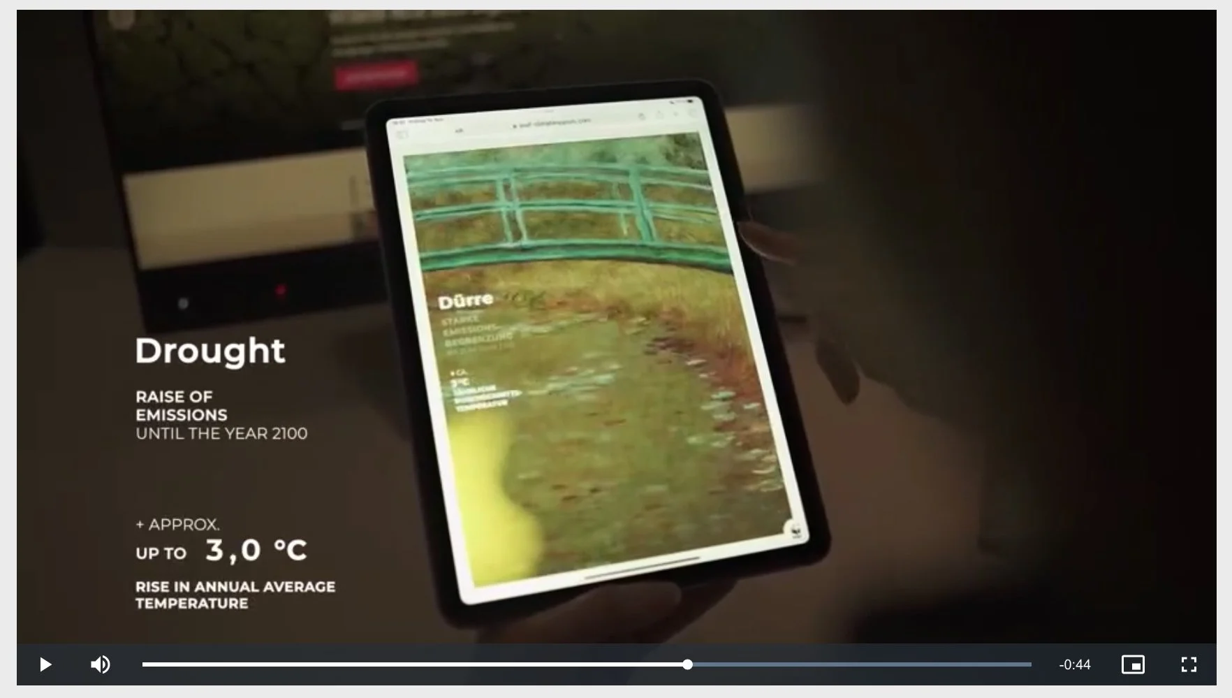
Eight famous landscape paintings by well-known artists were used, and by combining regional data, the scenes were reimagined due to extreme climate change.
Monet reimagined in a climate crisis
I absolutely loved this example. Created by global agency Leo Burnett for WWF clients, this clever campaign uses data along with a team of climate researchers and AI experts. The artworks were animated in each artist's style and put into their new environment due to the consequences of climate change.
This powerful digital design is a great way of evoking the reader to act. Imagine Monets’ waterlily pond with a 3.0c annual temperature increase by 2100.
The Plastic Forecast Award: D&AD Yellow Pencil 2024
The Plastic Forecast," was a groundbreaking campaign that tied the devastating effects of plastic pollution to something as familiar as the weather. By integrating landmark research on plastic particles found in rain with real-time meteorological data, provided daily estimates of ‘plastic rain.’
This pencil-winning campaign serves as a powerful example of how a local community could draw attention to the overuse of single-use plastics. By connecting a global issue to a relatable and immediate concern like the weather, it transformed an abstract environmental problem into something concrete and visible. Adapting this concept to focus on local plastic pollution could resonate deeply with my community, making the issue personal and urgent. With the involvement of local media and an app for community engagement, a similar initiative could mobilise collective action and possibly drive change at the grassroots level.
Reference List
Websites/Podcast
https://www.dandad.org/awards/professional/2024/238098/climate-realism/

